In this lab we were given census tract data and high school boundary data and told to determine the approximate number of students who fall in each school zone. The issue is that the census tract polygons and the school boundaries do not align in any useful way. By splitting census tracts that fell within different high school boundaries, then weighting the population estimate based on the area that fell in each boundary (i.e. aerial weighting), a relatively accurate and easy-to-produce estimate was determined; error was at 10.95%. Then, by incorporating land cover data, specifically imperviousness, the error decreased to 10.19%. The imperviousness of each split census tract was used to weight the proportion of the entire census tract that would be assigned to it. Using the dasymtric mapping method was useful for projects like this, because surveying a community individually would require large amounts of time and resources, though accuracy would be higher.
Tuesday, December 9, 2014
Lab 15 – Dasymetric Mapping
Dasymetric mapping is a mapping technique that involves using ancillary spatial data to improve the visualization and accuracy of spatial phenomenon that is known to not be uniformly distributed throughout the landscape. An example of this is population density, which is presumed to vary greatly spatially within the census tracts which are used to estimate density. By using smaller aerial units, say census blocks, we know that the population density is not uniform within the census tract. By using land cover data, the accuracy can be improved further, as we presume that population density is zero in forest areas and water bodies otherwise not accounted for.
Thursday, December 4, 2014
Lab 14 – Spatial Data Aggregation

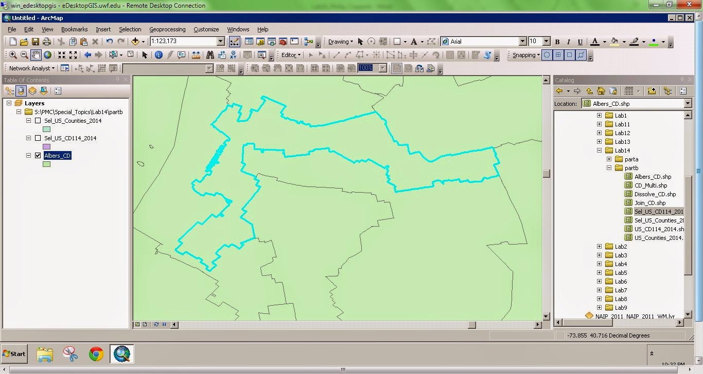
Gerrymandering is the manipulation of political boundaries so as to favor one party or class. The favorable outcome is a result of the statistical influence of scale and zonation of areal units. This manipulation of boundaries often produces odd shaped districts. The two images to the right show two outcomes of gerrymandering. The top image depicts a district boundary that chops up a county. The bottom image depicts a very elongated, irregular district.
Wednesday, November 26, 2014
Lab 13 – Effects of Scale

The
elevation data comparison shows that the LiDAR DEM had a greater range of values
compared to the SRTM DEM; the minimum value was smaller and maximum value was
larger for the LiDAR DEM. This may be an
indication of greater elevation resolution.
The mean elevation value was lower for the LiDAR DEM. Though these differences are apparent here, the
magnitude of the difference is small and not likely significant.
The
slope and aspect summary statistics are highly similar between the two datasets
as well. The mean slope of the SRTM DEM is
smaller, though this can be inferred based on the smaller range in elevations
of this DEM. It may be assumed that the
LiDAR data is more accurate; however, the overall difference between the two
datasets is very minimal. I suspect the
LiDAR dataset is more accurate for two reasons: First, it is the product of a resampling
technique whereby the underlying accuracy of the high resolution 1-m DEM is
certainly higher than the derive 90-m DEM.
Second, the SRTM DEM was created via orbital spacecraft, which, inherently
introduces a higher degree of vertical measurement error.
Friday, November 21, 2014
Lab 12 – Geographically Weighted Regression
Spatial regression can be used in GIS to model a phenomenon of interest. In non-spatial regression analysis, spatial auto-correlation is generally undesirable. Spatial regression attempts to quantify auto-correlation and use it as an explanatory variable. Geographic Weighted Regression (GWR) is a specific spatial regression used to account for multicolinearity. In the lab this week we compared GWR to OLS regression. The model output from GWR regression was better (i.e. had a lower AICc) than the OLS model. Further the z-score was lower, indicating that there was spatial dependence in the phenomenon of interest.
Wednesday, November 12, 2014
Lab 11 – Multivariate Regression, Diagnostics and Regression in ArcGIS
Regression analysis can be used in ArcGIS to model a phenomenon which may vary spatially. There are three main reasons for regression analysis: 1) to predict values in unknown or un-sampled areas, 2) to measure the influence of variables to a particular phenomenon, or 3) to test hypotheses about the influence of variables on a phenomenon. It is very important to test the usability, performance, or predictive power of a model due to its potential in policy decisions. There are several diagnostics to test the performance of a regression model that go past simply determining the R-squared value (which may be very misleading). ArcMap contains an Ordinary Least Square regression tool, among others, which produces some of these diagnostics, however it is up to the user to evaluate these statistics in the context of the model. The six step process outlined by ESRI to interpret these statistics provides a foundation for determining the "best" model. One important thing to note is the frequency distribution of residuals in a histogram. The residuals should be distributed standard normal. A positive or negative skew may be the result of spatial auto-correlation. This is perhaps the biggest use of regression analysis is GIS, as spatial analysis is central in ArcMap processing.
Tuesday, November 11, 2014
Module 10 Lab: Supervised Classification
 |
| Above is a supervised classification of Germantown, Maryland generated using ERDAS Imagine supervised classification. The map was ultimate composed in ArcMap. |
1.
I
used the seed polygon method to generate the signature polygons. A distance threshold value of approximately 25-50 was generally used. In cases when only one class was
created and the class was relatively obvious, for example water, then I used a
higher distance threshold value. In cases when there were
many classes for the same classification, for example Agriculture 1-4, I used a
lower threshold values. The lower values and many
classes allowed for high coverage with minimal (or none) mis-classification.
Tuesday, November 4, 2014
Module 9 Lab: Unsupervised Classification
 |
| A map depicting the unsupervised classification of University of West Florida campus. There are four different Information Classes. |
Subscribe to:
Posts (Atom)